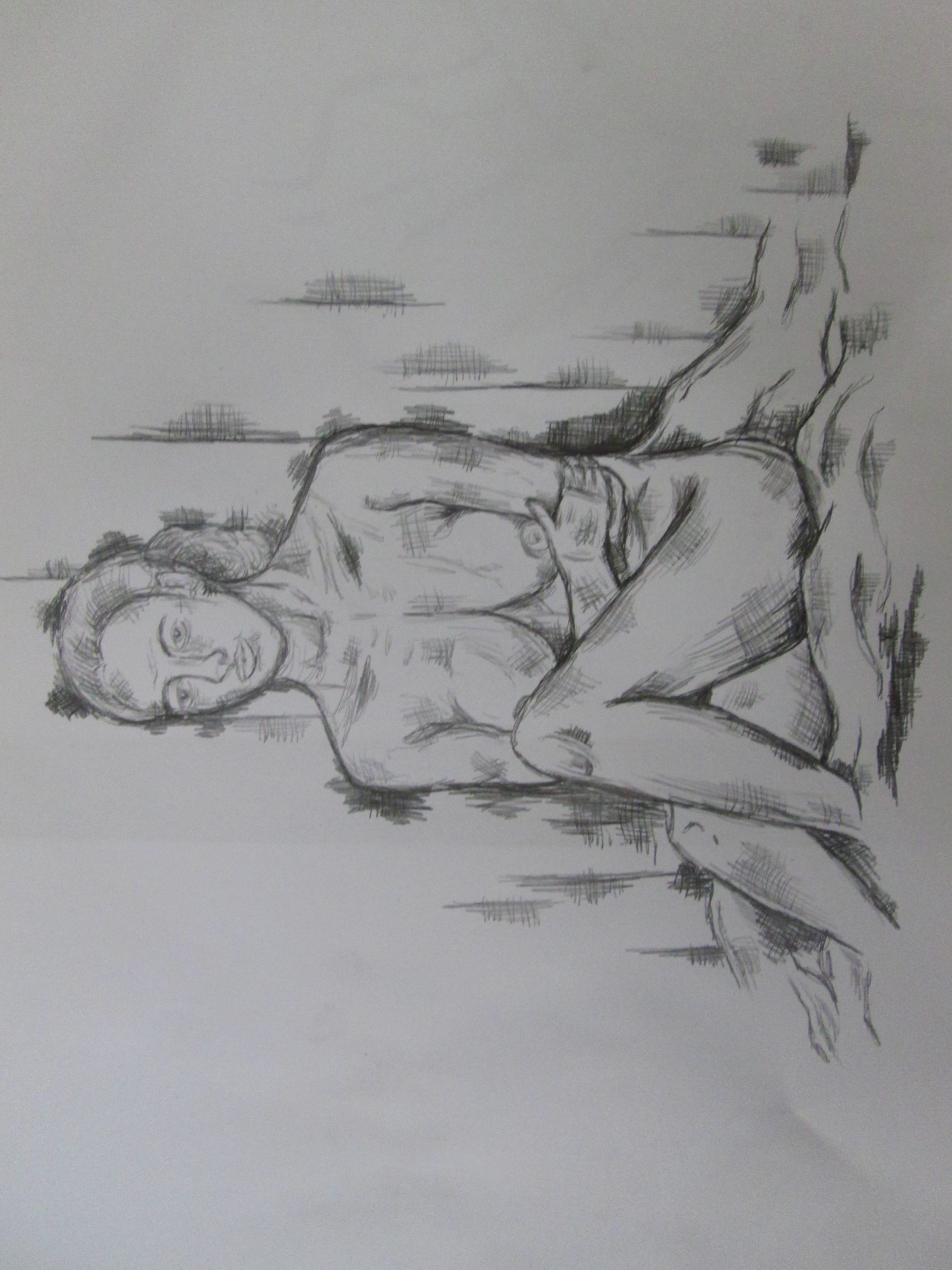
Large Painting – Reflecting and Bringing Together my Findings so Far
Posted: March 12, 2014 Filed under: Documentation, Field | Tags: Acrylic Paint, alone amongst others, alone in the city, Art, art degree, Art Piece, Art Student, artist, charcoal, consolidating, dry brushing, gouache, hidden loneliness of the city, Ink, loneliness, Mixed media, painting, palette knife, reflecting, sepia, sepia tones, underpainting, urban loneliness Leave a commentI am very pleased with the body of work that I have been producing relating to the City. I feel like I have an interesting concept, exploring the Hidden Loneliness of the City and have experimented with this idea in depth. However, I felt like I needed to consolidate my findings and portray what I have learnt and think is working so far. I decided to make a piece reflecting on these findings.

In this piece, I have incorporated a variety of different medias including paint, ink, charcoal and gouache. I have portrayed the sepia tone influence that I have been working with inspired by an artist I came across in Berlin and user Shoe 18 on the deviantart forum. I started off with a dark brown ground here, influenced by my experimentation after undertaking the grounds workshop, I also painted an underpainting using a palette knife and worked on top of this employing Dry Brushing techniques that I learnt from attending the paint workshop sessions with James Green. I have worked with the concept of all of the people around you being insignificant and portrayed that they are just bodies and may as well just be white silhouettes because I believe it is particularly successful and left one person in colour to show they are lonely and singled out among all the others that they do not interact with.
I wanted to formulate a piece that includes all the experimentation and things that I have learnt that I believe have been positive and successful within this project. I believe this is an accurate reflection of this and a successful piece of work in itself. Now that I have consolidated and reflected, I feel that I can move on in my project with confidence and continue my experimentation.
After my tutorial on Monday, I realised that I haven’t experimented with monochrome because I was so inspired by the influences of the artists I mentioned, but this is what I will be working with next, I believe that the loneliness may be heightened by an empty monochrome background and the colours of the one person will appear more vibrant and therefore the person will stand out more. This seems like it will progress my work further and add to the portrayal of the Hidden Loneliness of Cities.
Life Drawing 21/2/14
Posted: February 21, 2014 Filed under: Documentation, Field | Tags: Art, Art Student, artist, charcoal, Cross Hatching, detailed life drawing, documentation, Drawing, drawing from life, drawing movement, Drawings, female, female life model, female model, Fine Art, Ink, life class, life drawing, life drawing session, memory drawing, model, sketch, Sketching Leave a commentI decided to attend a life drawing session today. Within my city project, my work is becoming highly figurative which is challenging for me and not something I am used to. I felt that life drawing would help bring me up to speed when working with proportions and drawing the body and it was an incredibly beneficial exercise. We started the session with a few 5 minute poses to get going:

I started by loosely sketching out in charcoal and adding watered down black ink on top, I wanted to get a feel for the figure and the proportions of the body.
I spoke to the life model about my city project and that it involved drawing crowds of people or painting many figures in one piece. She helpfully suggested that we did some quick memory drawings, so she posed for 40 seconds while I observed and then had to draw the poses from memory down on the paper. It was incredibly difficult but a valued exercise as people don’t stay still for long in the city and this method will definitely help me draw them more accurately. It taught me to take more time to observe what I am drawing.


After a few goes, it was really interesting to see how much I managed to remember and draw down. The two pencil drawings above are my two most successful memory drawings in my opinion. This exercise forced me to study the details and proportions of the figure in a lot more depth and has with out a doubt benefited my figurative drawing skills. The life model suggested that I did a moving life drawing, where she imitated walking in two minute poses and I just drew them down next to one another, which created a highly interesting result, shown below:

After I had drawn these poses and gotten more comfortable with drawing the figure, we moved on to drawing 20 minute poses where I had the chance to draw in a lot more detail and I am incredibly happy with the results. I would go as far as to say that these may be two of the best life drawings I have ever created and I was very proud that I could see the development in my drawing skills.

Attending a life drawing session has been an incredibly valuable experience and will definitely aid me in my progression through my city project. I feel more confident about drawing figures. Because the drawings were timed, I didn’t have time to worry about the outcome and it made me consider proportion and experiment when drawing the figure more naturally. For any one who feels like they are challenging themselves drawing figures like me, I would definitely recommend a life class.
Combining Drawing with my Photography: Sketchbook Work
Posted: February 21, 2014 Filed under: Documentation, Field | Tags: alone in the city, Art, Art Student, artist, Arts, city, city outlines, Collage, documentation, draw, Drawing, drawing combined with photography, field, Fine Art, hidden loneliness, Ink, lonely, lonely art, Pencil, Photography, sketch, sketchbook, sketchbook work, skyline, urban loneliness Leave a commentHere I have attempted to illustrate being alone in the city, and feeling overwhelmed by its mass structure and buildings through combining the drawing of simple city outlines and my photography of people in the city.


I have experimented with a few different medias when creating these kind of collages including pencil, fine liner, black indian ink, nut-brown ink and ball point pen.


I think the outcomes show the figure to be isolated and I like the contrast in detail and complexity between the drawing and the photography. I am enjoying exploring displaying urban loneliness artistically and even though these are simple images, they do portray being alone in the city.


City Loneliness: Sketchbook Experiments with Ink, Charcoal and White paint
Posted: February 11, 2014 Filed under: Documentation, Field | Tags: Acrylic Paint, alone, Art, Art Student, artist, Arts, charcoal, city, colour, documentation, Drawing, field, Fine Art, Ink, inspiration, isolation, loneliness, Mixed media, urban loneliness, Visual Arts Leave a commentAfter being heavily influenced by the colour palette and technique in the work of an artist I saw in the urban spree gallery and the work of the user shoe18 on deviantart online (previous blog post), I decided to experiment with their inspiration. Here I have used Black and Brown drawing inks, charcoal and white paint to produce these quick explorations.


These quick art works definitely highlight loneliness in the city. I used my photo manipulation work as a reference for these pieces. The white silhouettes of all the people around you in the city who may as well not be there, came from the cut outs I produced.
I think the colour palette here is highly successful, I definitely want to produce mixed media paintings using these colour schemes to show the hidden loneliness of the city and how dull and dark it can be and feel. There is a differentiation between the person concerned and the people around them but I don’t feel it’s very successful. To improve it, when I produce paintings, I will take a lot more time making them and paint one person in colour and everyone else white silhouettes. I may even give the other people more definition and detail and give the colour figure no features to show that you are lonely in the city and when wandering it, you may as well not have an identity. People don’t notice anything distinguishing about you. I am keen to progress and move forward with these ideas.
Experimenting with Tracing Paper
Posted: February 10, 2014 Filed under: Documentation, Field | Tags: alone, Art, Art Student, art with tracing paper, artist, Artwork, Black and White, black and white photography, documentation, Drawing, field, Fine Art, foggy, Ink, isolation, loneliness, lonely, masking tape, Pen, Photograph, Photography, tracing paper, transparency, urban loneliness, Visual Arts Leave a commentI have been experimenting with tracing paper within my hidden loneliness project. I wanted to highlight that when you are walking around the city, all the other people may as well not be there. I also thought about the fact that they are not important to you, they are just silhouettes passing you by that you may catch a glance with every now and then.


The existence of the other people around you is very transparent with not much significance or importance in your day. I thought the use of tracing paper highlighted this transparency. I started thinking about people being in a rush to do things or get to places in the city and how the world around them is foggy and muffled and not really taken note of. I experimented with placing tracing paper over my black and white photographs and drawing one person only in bold black fine line on top to highlight this observation.


I think these explorations are successful, they definitely convey an immediate feeling of loneliness and look artistically interesting. There is something highly charming about them. However, I’m not sure I will be incorporating the use of tracing paper into my art work or final pieces for this project. Experimenting with it has been valuable and made me consider more ideas and think about not noticing other people or the city around you when you are in a hurry. I may incorporate its use into the collaborative drawings I am working on in my field group.
INSPIRATION: Artists that influence my ideas to create artwork highlighting the loneliness of city life
Posted: February 5, 2014 Filed under: Contextualisation, Field | Tags: alone in the city, Art, artist, city, city loneliness, digital art, Drawing, dripping ink, Fine Art, influence, Ink, inspirational art, loneliness, loneliness art, Mixed media, monochrome, overwhelming, painting, sepia tones, visual art Leave a commentThis artists work grabbed me as soon as I saw it. I love the scratchy line work and limited dull colour palette. I am highly influenced by how the use of dark line and monochrome and sepia tones are heightening the loneliness of the single figure in the foreground of the piece. The figure looks overwhelmed by the city and alone, emotions I would like to capture within my work.
The piece below “Alone in the City” is a combination of hands on drawing and digital editing. Unfortunately I am unsure of the name of the talent that produced this piece, but they show their work under the username shoe18.
http://shoe18.deviantart.com/art/Alone-in-the-City-170647391

This colour palette and the idea of mixing media’s is something I am keen to start working with. The varied tone within each colour gives the piece a lot of mood and draws me to think about the use of black and brown drawing inks to capture similar effects. Maybe I could use the ink as a ground and then paint and draw into it. This style really jumps out at me and reminds me of a piece I saw in Berlin in the Urban Spree Gallery shown below.

Again in this piece, even though there is a hint of blue coming through, the colour palette is based around blacks browns and white. I am definitely going to be heavily inspired by the works of both these artists and experiment with showing how you can be lonely even when you are around many people whilst employing inspirations from their style and limited colours. Unfortunately, again I’m not sure of the name of this artist’s work, it was tucked away on the floor in the gallery in Berlin but instantly grabbed me as a useful influence to my art work. The uncontrolled drips within this work are something that I would like to experiment with too. Already cannot wait to get stuck in.
ZACHARY JOHNSON
Posted: January 27, 2014 Filed under: Contextualisation, Field | Tags: Art, dark, Drawing, field, Fine Art, Ink, Pen, sketch, Zachary Johnson Leave a commentZachary Johnson travelled around a lot and took note of just how lonesome each big city he went to was, despite the company of dozens, hundreds, or even thousands of people.
This is highly relevant to my ideas of a hidden loneliness even though you are amongst other people.
Johnson’s collection of pen and ink illustrations known as Lonely Cities depict beautiful, towering architecture, occasionally including tiny people, yet they manage to capture how isolated one can feel. The seemingly simple, monochromatic sketches are rich with their own urban culture and style, though they all share a feeling of desolation and isolation. They are simple pieces but highly effective, the dark tones within them add to the negative feeling.


It is clear to me that there are many ways I could approach showing the hidden loneliness within the city. Zachary Johnson’s work inspires me to work with dark materials like charcoal and pen and ink when drawing down ideas and observations in my sketchbook. It has also shown me that simply sketching the city itself can emit a sense of isolation.
A Few Quick Drawings from my Sketchbook
Posted: December 3, 2013 Filed under: Documentation, Subject | Tags: Art, biro, charcoal, Cross Hatching, Drawing, Fine Art, indian ink, Ink, Mixed media, Multiple Media, Pencil, sketchbook, sketches, Visual Arts, wash, Wet-on-wet 1 CommentHere are a few drawings from the sketchbook that I have been keeping throughout this project. I have experimented with a variety of drawing materials and techniques to formulate this book.


I have experimented with Continuous Line drawing, Drawing with ink wet on wet and wet on dry and then drawing into it, Drawing onto grounds, Drawing onto washes that look like mould, Pencil Drawings, and Drawing with Biro, Fine Liner and Charcoal. I have used charcoal pencil to draw into black indian ink and produced some succesful results using this technique. Drawing moulding food is something I have been doing as a starting point to help me move my project forward when I’m not really sure where I’m taking it. I also think it is important to keep drawing as inspiration for the pieces you are going to create. As this project is about TIME, I have been producing some quite expressive timed drawings as well. These time drawings range between 10 seconds and five minutes.
Life Drawing Workshop: Using Ink, Water and Charcoal
Posted: November 10, 2013 Filed under: Contextualisation, Documentation, Subject | Tags: Art, artist, Brush, charcoal, documentation, Drawing, Fine Art, Ink, Marlene Dumas, Visual Arts, Workshop 2 CommentsIn this Workshop, I experimented with a variety of drawing techniques using black indian ink and charcoal. I feel these techniques have helped me to draw the life model more successfully than if i was just using a pencil or charcoal on its own. The ink almost guided me and took all my anxieties about proportion and making things perfect away. In this workshop I worked with two conditions: Wet on Wet and Wet on Dry. Wetting the paper first encouraged the ink to bleed and run more where as just painting it onto dry paper gave it a little bit more control and I was able to produce more crisp lines.

I started the portrait below by wetting the paper and painting on the rough shape of the life models face and features with ink. I had no control over how the ink was going to spread or how much it would bleed, which in a way was positive as it stopped me worrying about making a completely proportionally accurate drawing and more about making something visually exciting. I added water to the ink in different quantities in separate containers so I could use the different strengths to create a sense of light and shadow and tone. The Patterns that the ink made were completely involuntary and out of my control. After I was happy with the appearance of the ink on paper I let it dry and used it as a guide to draw in the face and details in charcoal. I was surprised by how well this drawing turned out considering I didn’t think about scale or proportion at all. I usually find drawing the human face extremely challenging but the ink made my drawing style more free. I let the ink guide me and then drew into it rather than drawing the details in first and then applying the ink.

Before undertaking this workshop I looked at the ink artworks of south african artist Marlene Dumas. Her work encouraged me not to worry about what the ink is doing on the page because it’s the natural “mistakes” that can make the best outcomes.
MARLENE DUMAS


Marlene Dumas portraits are very free and almost abstract in some ways. Rather than representing an actual person, Marlene’s portraits represent an emotion or a state of mind. Themes central to her work include race, sexuality, guilt, innocence, violence and tenderness. Her work encourages me to be more free in my drawing and to think about drawing in a wider spectrum rather than just putting pen or pencil to paper, she has opened my eyes to the fact that you can draw with many materials. I really like her work, it has so much passion within it and the fact that she displayed all of her portraits together as one big piece inspires me to do the same. One piece doesn’t have to be a large painting or drawing it could be a series of them. This is something to think about when displaying my artworks in relation to decay.
Ink and Charcoal together are materials I am definitely going to use in the future. I will also revisit wet on wet and wet on dry using indian ink as it is an easy way of making interesting and creative drawings and achieves a great result.


Recent Comments