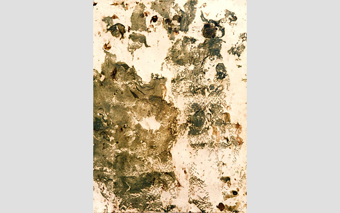
Initial Colour Experiments Portraying City Loneliness and Reflection – Inspired by Elena Romanova
Posted: March 9, 2014 Filed under: Contextualisation, Documentation, Field | Tags: Art, art experiments, art reflection, Art Student, artist influence, bright colours, colour, dripping ink, Elena romanova, Fine Art, influence, ink and wax resist, progression, reflecting on what I have learnt, reflection, unsuccessful, Vibrant, wax resist Leave a commentI have started working with brighter colours and attempted to portray the hidden loneliness of the city within the vibrancy. At the start of my project, when I was investigating artists that were inspired by the city itself, I came across the work of Elena Romanova, who combines wax resist techniques with inks.

Above: Elena Romanova’s work
I decided to employ her influence and produce some brightly coloured wax resists using crayons and vibrant drawing inks. I have worked with city skylines and a lone figure to start with and then moved on to thinking about a lonesome figure among others surrounded by silhouettes just like I have in my darker works and photo manipulations so that I can analyse which colour palette is more effective in portraying my city theme.


REFLECTION: I think the white crayon is more successful than the coloured crayons in terms of wax resist, but I do not think that these are successful images at all. I don’t think they portray the hidden loneliness of city life, and the figures within them simply don’t look lonely surrounded by vibrant colours. I am already seeing that the colour palette of my work affects the success of the message and how lonely the people are massively. I was going to experiment further with brighter colours, but I do not see the point anymore. The use of bright colours to show the loneliness of city life is unsuccessful even when one figure is surrounded by others that may as well not exist and the imagery is showing that you are alone even around others in the city. I have experimented with this idea and found it not beneficial to my project and so I will continue working with a duller and darker colour palette.
Now that I have clarified this, I will work on a darker piece inspired by the artist I saw in the Urban spree gallery and user Shoe18’s piece on deviant art incorporating my successes within this hidden loneliness in cities exploration so far. I will portray the idea that you feel lonely even when surrounded by others and to them you may as well not exist because I feel it is the most successful portrayal I have explored. I will also include cut out silhouettes inspired by my photo manipulations and have one person singled out in colour influenced by the girl in the red coat in the movie Schindler’s List. I will employ techniques such as dry brushing inspired by my paint workshop and work on a dark ground as I felt this was highly successful when I was influenced to work with one by the grounds workshop I attended. I am hoping this will make for a highly successful outcome and am keen to start working on it.
INSPIRATION: Artists that influence my ideas to create artwork highlighting the loneliness of city life
Posted: February 5, 2014 Filed under: Contextualisation, Field | Tags: alone in the city, Art, artist, city, city loneliness, digital art, Drawing, dripping ink, Fine Art, influence, Ink, inspirational art, loneliness, loneliness art, Mixed media, monochrome, overwhelming, painting, sepia tones, visual art Leave a commentThis artists work grabbed me as soon as I saw it. I love the scratchy line work and limited dull colour palette. I am highly influenced by how the use of dark line and monochrome and sepia tones are heightening the loneliness of the single figure in the foreground of the piece. The figure looks overwhelmed by the city and alone, emotions I would like to capture within my work.
The piece below “Alone in the City” is a combination of hands on drawing and digital editing. Unfortunately I am unsure of the name of the talent that produced this piece, but they show their work under the username shoe18.
http://shoe18.deviantart.com/art/Alone-in-the-City-170647391

This colour palette and the idea of mixing media’s is something I am keen to start working with. The varied tone within each colour gives the piece a lot of mood and draws me to think about the use of black and brown drawing inks to capture similar effects. Maybe I could use the ink as a ground and then paint and draw into it. This style really jumps out at me and reminds me of a piece I saw in Berlin in the Urban Spree Gallery shown below.

Again in this piece, even though there is a hint of blue coming through, the colour palette is based around blacks browns and white. I am definitely going to be heavily inspired by the works of both these artists and experiment with showing how you can be lonely even when you are around many people whilst employing inspirations from their style and limited colours. Unfortunately, again I’m not sure of the name of this artist’s work, it was tucked away on the floor in the gallery in Berlin but instantly grabbed me as a useful influence to my art work. The uncontrolled drips within this work are something that I would like to experiment with too. Already cannot wait to get stuck in.
‘Lonely Cities’ series, Zachary Johnson
Posted: January 29, 2014 Filed under: Documentation, Field | Tags: Art, Fine Art, influence, inspiring, loneliness, My Research Influencing Another Artist Leave a commentMY ARTISTIC RESEARCH INFLUENCING ANOTHER ARTISTS WORK:
It is always satisfying to see that your own research has influenced another artist. It is interesting to read the ideas that someone else draws out of images that you have been looking at and I am glad I could Inspire another with my presentation.


After viewing a fellow artists Petcha Kutcha presentation, I was immediately entranced by the works of an artist they had researched themselves. Zachary Johnson is an artist that focuses on the cities he resides in; the complexities and beauty that is so rife within the structures and buildings within the city. The use of pen and ink creates a fascinating ‘vanishing effect’ when intended, and creates a sense of a city fading out of existence, as well as a single organism in a white void, crafting an encroaching sense of loneliness.
There is also a great stillness that is weaved into the very lines that are on the paper, causing the often frenetic and busy drawings to take on a rather paradoxical nature, much like the stillness experienced in the dead of night at a city (This seems quite interesting, maybe I will return to this idea of the stillness…
View original post 33 more words
Investigation into Food Decay – Influential Artist, Photographer and Microbiologist
Posted: January 20, 2014 Filed under: Contextualisation, Subject | Tags: Albert Einstein, Art, Art Student, artist, Arts, Artwork, Decay, decaying art, Fine Art, Food, Food Decay, influence, Mixed media, Mold, Mould, mould portraits, Moulding art, portraits, Time, visual art, Visual Arts Leave a comment“As far as artistic methods go, it’s certainly creative. A photographer, and former microbiologist, has worked out how to make portraits by growing strategically placed bacteria cultures.
Zachary Copfer developed the technique, which he dubs ‘bacteriography’, using photographs of famous faces such as Charles Darwin, Albert Einstein and telescopic images of the Milky Way.
It works by taking a bacteria such as E.coli, turning it into a fluorescent protein and spreading it across a plate.
A negative of the photograph is then layered on top of the plate and exposed to radiation with the bacteria growing up in strategic places to bring out the image. It is then coated in acrylic and resin.”


This is highly influential to my food decay over time project as like me, here is an artist creating art from mould and being inspired by Decay. I saw this artists work after creating my petri dish piece and thought it was highly interesting. It is amazing that he has figured out a way to control the mould to make it produce portraits. This contrasts with my work because I am letting the mould itself create elements of my project, where as he is guiding the mould to create specific things. It is interesting, the artistic possibilities that emerge from something that is commonly taken for granted or used for a far different purpose.
Exisiting Artworks Relating to Mine
Posted: November 15, 2013 Filed under: Contextualisation, Subject | Tags: Art, Artists, Decay, Fine Art, influence, Inspirations, Mixed media, Mold, Mould, Moulding art, Photograph, Robert Rauschenberg, Time Lapse, visual art Leave a commentWhilst doing some research yesterday I came across a few artists that relate to my work. Looking at the work of Gail Wright, Haruko Okano and Robert Rauschenberg instantly made me think of the moulding artwork that I have created (shown below for reference). Like me they have created artworks that decay over time and used mould to create an art piece. I am starting to see that making a moulding artwork can change people’s perception of decay. If there is a mouldy canvas displayed in a gallery it is instantly less disgusting and more appealing to the viewer. The viewer is encouraged to look at it as a piece of art rather than a horrid entity that has grown on your food in the fridge. It’s quite interesting that the setting and context of something can change how people feel about it. CreatIng time lapses (as seen below) are also an interesting concept as it allows the viewer to see a process that normally they would not.

Mould and Decay is constantly overlooked and considered to be something horrid and that should be thrown away. But in reality, mould can create homes for millions of tiny organisms and as I found out fruit flies love to live in it. Most importantly, without studying the growth of mould and its properties we would be without certain medicines and antibiotics such as Penicillin. If we can ingest tablets that are made from it, then WHY CAN’T WE CONSIDER IT AS ART.

GAIL WIGHT
Gail Wight has produced many moulding artworks and time-lapse videos of the development of living organisms. She is highly interested in the idea of living art mediums which could not be more relevant to my project on food decay. Her work, I feel captures a beauty within the mould, something I would like to capture within my work. The work definitely changes the human perception of how you would describe mould and pushes the boundaries of what art is.


Gail Wights work encourages me to be confident in my project and not to worry about what other people think of the work I am creating. I would like to make people see that there are a lot of hidden beauties in the world that we overlook and mould and decay is included in that statement.
HARUKO OKANO
Below, are some of Haruko Okano’s mould paintings created in 1997. Okano’s pieces were among the first existing moulding artworks I saw. In this artwork, the mould was cultivated in a large 8ft by 4ft tank in a solution of black tea and sugar. His work encourages me to use tea and sugar within my work at some point to see what results I get. However, Unlike these artists I have far more limitations and do not have the facilities to leave things to mould over long periods of time.


There is a very specific colour palette to these moulding artworks and they almost do not look like mould at all. They could easily be paint or mixed media canvases. I like that the viewer here would wonder whether they are looking at actual mould which is something I have tried to capture in my paintings of mould using sugar and paint and cotton wool. I know that this is the case because my peers and tutors have had to ask me whether they are made using real mould or not. To me, this means they are highly successful artworks.
ROBERT RAUSCHENBERG
Rauschenberg – Dirt Painting (For John Cage)

Rauschenberg has used a combination of dirt and mould to produce this artwork. It was a highly controversial piece when it was produced and as it was exhibited, people were creating their own response to it and questioning whether it could really be called art at all. Personally, I feel that it is visually beautiful and interesting to look at.
All of these artist are deeply influential to my project. All see mould and decay as a medium in which to create art. I will continue researching artists that relate to my work because I feel it is highly beneficial and helps you develop new ideas and concepts.


Recent Comments