Artist Research: Kimsooja: A Needle Woman
Posted: March 20, 2014 Filed under: Contextualisation, Field | Tags: a needle woman, alone in the city, Art, art student research, artist, artist influence, Contextualisation, hidden loneliness of city life, kim sooja, kimsooja, loneliness in the city, overlooked, people just passing you by, single figure, surrounded by others but alone, unnoticed, Video, video art, youtube Leave a commentThe artist Kimsooja was brought to my attention by one of my tutors. In particular, it was suggested that I looked at “A needle woman”, a video installation of the artist standing in the middle of busy streets in different parts of the world as people pass her by and walk in the direction of the camera. She is a feminist artist and is approaching women’s labour of sewing within this work but I believe it definitely applies to the concept of my city project even if being alone or singled out amongst others in the city was not the artists original intention.
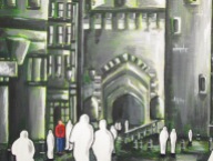
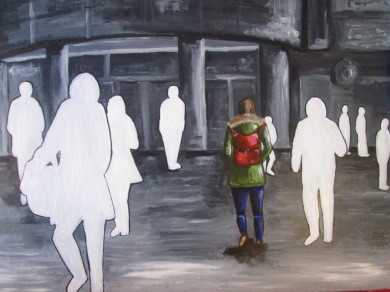
This work made me think about the hidden loneliness of city life and the notion of being surrounded by others in the city but alone. She is standing in the middle of many people, but no one is interacting with her, she is being overlooked and people are just passing her by. She is an insignificant figure to them and at the same time all the people around her may as well not be there at all. The feeling of loneliness if highly evident in this work and I believe her video showing herself surrounded by others who are not interacting with her or even acknowledging her existence is not dissimilar to my project imagery of a coloured figure surrounded by white silhouettes.
This piece is highly inspirational and influential to my work, it confirms to me that you can be surrounded by others in the city but at the same time singled out and alone. It sort of highlights the ideas I have been working with and in supporting them adds to my works success.
Initial Colour Experiments Portraying City Loneliness and Reflection – Inspired by Elena Romanova
Posted: March 9, 2014 Filed under: Contextualisation, Documentation, Field | Tags: Art, art experiments, art reflection, Art Student, artist influence, bright colours, colour, dripping ink, Elena romanova, Fine Art, influence, ink and wax resist, progression, reflecting on what I have learnt, reflection, unsuccessful, Vibrant, wax resist Leave a commentI have started working with brighter colours and attempted to portray the hidden loneliness of the city within the vibrancy. At the start of my project, when I was investigating artists that were inspired by the city itself, I came across the work of Elena Romanova, who combines wax resist techniques with inks.
Above: Elena Romanova’s work
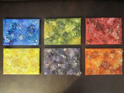
I decided to employ her influence and produce some brightly coloured wax resists using crayons and vibrant drawing inks. I have worked with city skylines and a lone figure to start with and then moved on to thinking about a lonesome figure among others surrounded by silhouettes just like I have in my darker works and photo manipulations so that I can analyse which colour palette is more effective in portraying my city theme.
REFLECTION: I think the white crayon is more successful than the coloured crayons in terms of wax resist, but I do not think that these are successful images at all. I don’t think they portray the hidden loneliness of city life, and the figures within them simply don’t look lonely surrounded by vibrant colours. I am already seeing that the colour palette of my work affects the success of the message and how lonely the people are massively. I was going to experiment further with brighter colours, but I do not see the point anymore. The use of bright colours to show the loneliness of city life is unsuccessful even when one figure is surrounded by others that may as well not exist and the imagery is showing that you are alone even around others in the city. I have experimented with this idea and found it not beneficial to my project and so I will continue working with a duller and darker colour palette.
Now that I have clarified this, I will work on a darker piece inspired by the artist I saw in the Urban spree gallery and user Shoe18’s piece on deviant art incorporating my successes within this hidden loneliness in cities exploration so far. I will portray the idea that you feel lonely even when surrounded by others and to them you may as well not exist because I feel it is the most successful portrayal I have explored. I will also include cut out silhouettes inspired by my photo manipulations and have one person singled out in colour influenced by the girl in the red coat in the movie Schindler’s List. I will employ techniques such as dry brushing inspired by my paint workshop and work on a dark ground as I felt this was highly successful when I was influenced to work with one by the grounds workshop I attended. I am hoping this will make for a highly successful outcome and am keen to start working on it.
Hidden Loneliness in Cities – Colour Exploration – Artists That Have Explored Urban Loneliness Through Brighter Colours
Posted: March 9, 2014 Filed under: Contextualisation, Field | Tags: alone in the city, alone in the city art, Art, Art Student, artist influence, artistic inspiration, Artists, bright colours, casoni ibolya, colour, colour exploration, Contextualisation, existing artists, feeling lonely, field, Fine Art, Leonid Afremov, loneliness in the city, miki de goodeboom, urban loneliness, vibrant colour Leave a commentAfter producing quite a successful and substantial body of work focusing on the use of monochrome colouring and sepia tones, I have decided to investigate whether these colours are affecting the loneliness of my work. After producing my green shaped underpainting, I started thinking about the fact that the figures didn’t appear to look as lonely as in my darker works and so I would like to clarify this by briefly investigating and producing some brighter works and analysing their success in showing the hidden loneliness of city life.
To start, I thought it would be beneficial to investigate whether existing artists have attempted to show loneliness in cities through bright colours. I have come across a few, but I do not feel that the figures within them feel as lonely, because darker colours create a negative atmosphere and bright colours a positive one, so the figure seems to look like they are just happily walking through a colourful city even though they are alone, rather than feeling down and depressed by the fact that they are.
Leonid Afremov – “Alone in the City”
I am really drawn to the technique adopted by Leonid Afremov, however, in terms of portraying loneliness, I just feel that the figure looks as if they are walking back from somewhere by themselves. In my work, I am investigating portraying loneliness in the city where there is others around you. It is horrible to think that there are so many people but you interact with no one which heightens how lonely you feel in my opinion. This is a beautiful painting but I am not sure it portrays the same message as my work or is successful in showing loneliness in the city, partly because of the bright more positive colours and partly because there are no other people for the figure to feel lonely around or feel like they don’t exist to.
Miki De Goodeboom – “Lonely in the Big City”
I think the abstract nature of Miki De Goodeboom’s piece is highly successful, even though there is no city like imagery behind the figure, because of the square and geometric shapes our brain seems to associate them with one. Here, I do feel that the figure looks lonely, I think it is because of the chaotic looking city and the figure seems to look overwhelmed being alone within this chaos. Also, the colours here are not as bright as in Afremov’s work.
Casoni Ibolya – “The Rainbow City after Rain Alone”
I like the softness of the work here, Even though the colours are not as vibrant as the other two artists I have looked at, the artist has still used brighter colouring to portray inner city loneliness. Again, here I feel that the figure does look lonely. I think this is to do with the fact that the world around them is colourful and they are painted in blacks and greys. The work makes me feel as if the figure feels alone and as if they don’t belong in this environment.
After exploring how existing artists have portrayed loneliness in cities through the use of brighter colours, I am going to investigate it myself, I will produce some coloured works and experiment with the idea of there being lots of people around you but no interaction, just as I have in my darker works. I will then analyse the success of this and decided whether it is more affective to paint Urban Loneliness in bright or darker colours and continue to work with whatever the verdict is.
Tutorial: Artists to look at and Direction for progression
Posted: February 24, 2014 Filed under: Contextualisation, Documentation, Field | Tags: Art, Art Student, artist, Arts, Artwork, city, Contextualisation, David Hockney, direction, documentation, rakes progress, tutorial, william hogarth Leave a commentIn the tutorial that I had this morning, I was glad to be told I was working well and to be given some direction. The tutor suggested that I looked at the works of William Hogarth’s series “A Rakes Progress” and a set of drawings by David Hockney produced in response to Hogarth’s series of works.
As I am producing a project that is very much out of my comfort zone and includes people, It is refreshing to see how others have represented figures within their work. Hogarth’s figures are timeless and very realistic. I think he influences me most compositionally, as all his pieces convey a story and narrative yet are very balanced in their composition.
I am not particularly drawn to these works by David Hockney, but it is interesting and influential to see such an expressive style of drawing. The figures within these works are incredibly inspiring to me, they are very loosely drawn and I will take influence from them in my drawings and paintings incorporating white figure shaped silhouettes.
My tutor also said that the tracing paper experiments and photo manipulations are something that I should continue to work with and so I will be experimenting with these techniques and materials further this week.
Artist Inspiration – Nesta
Posted: February 22, 2014 Filed under: Contextualisation, Field | Tags: alone, alone in the city, Art, Art Student, artist, artist inspiration, city, City Art, digital art, digital collage, hidden loneliness, inspired by artist, isolation, loneliness, loneliness in art, loneliness in the city, lonely, nesta, photo manipulation, urban loneliness, white, white silhouette Leave a commentThe work of Nesta is highly relevant to my project. She portrays the loneliness of living in a city within her work and as I have done in my work portrays the figure as a white silhouette. However, she focuses on the fact that she may as well be invisible in the city and how she feels alone and I have looked at this subject from a different perspective.
“Alone in the City is a digital collage series based on my experiences living alone in London, I hoped to capture the day-to-day happenings of living in a big city by yourself.” -NESTA
I am focusing on everyone else around you in the city and the fact that they may as well not exist because of the loneliness and the zero conversation that occurs. I had already thought about making the figures silhouettes and white in colour to create a ghostly image, but her work confirms to me that it makes for a successful outcome.
Paint Workshop : Paint, Mediums and Glazes
Posted: February 19, 2014 Filed under: Contextualisation, Documentation, Field | Tags: Acrylic, Acrylic Paint, acylic copolymer, Art, Art Student, art workshop, colour glazing, colourfield, damar varnish, documentation, field, Fine Art, glazes, glazing, layering paint, layers, linseed oil, medium, mediums, oil paint, paint, paint mediums, paint workshop, painting, powder, stand oil, synthetic resin, varnish, visual art, Workshop Leave a commentToday, I attended an incredibly interesting workshop, where the tutor talked about paint, mediums that we can mixed with both oil paint and acrylic paint, varnishing, adding colour, layering colour and glazing with many layers of paint. I learnt so much this morning and I will outline all of the things that learnt during this workshop below.
Oil Paint and Acrylic Paint is made from the same pigment. Burnt Sienna is an exception to this rule, as art students we probable rarely use real burnt sienna pigment, it is now mostly synthetic. Certain pigments within paint have certain qualities, for example Naples Yellow has a thick and buttery quality to it and Rose Madder comes from a natural dye and is more of a liquid paint. Paints have very individual qualities but the only reason for this is the medium that is added.
Commonly, artists may use turpentine to thin oil paint however, turps evaporates and leaves nothing for the colour to bind to. Turpentine is not a medium and it shouldn’t be used to think oil paints. Linseed oil is the correct medium for this purpose, the colours don’t become transparent when using it and the paint binds easily. The thinner the paint you want, the more Linseed Oil you would add. Mediums give you the potential to change the consistency of paint by adding them to it. You can also use mediums to increase the drying time of oil paint.
To make oil paint, you use Linseed oil, you use it to extend oil paint also. Refined Linseed oil will slow dow the drying time when using oils. Stand oil is exactly the same material as linseed oil, its a lot thicker in consistency and because it is thicker, it tend to get rid of brush marks when it is mixed with paint and applied. If making acrylic paint, you wouldn’t use Linseed oil, you’d use an acrylic medium and copolymer, a colourless acrylic paint with pigment. This mixture should then b ground together as if you don’t bits of pigment will be floating in it. However, this could be a desirable effect to use within your work. If you extend acrylic colours with PVA Homopolymer the paint will become glossy and plasticky. You can add a matting agent to if afterwards if you want to get rid of the glossy effect. The paint will be a lot thinner when you add copolymer but you can thicken it uo with copolymetric thickener. The more you add the thicker it gets but if you put too much it will solidify. It is really interesting to me that making and using mediums is like baking and following a recipe. If you wanted your paint to be thick, chalky and dry you could add powders to it. With Acrylic, you could paint a thicker mixture of paint and powder on and it would be dry and ready to work with in just 30 minutes. Acrylic paint is a glue, if you were using it with collage, it would stick the collage material to the painting. Acrylic is a lot less harmful than oil paint. Oil materials involve solvents and chemicals, also acrylic paint has a greater rang of consistencies. For example, you cannot make matt oil paint. The possibilities are greater with acrylic but oil paint is still favoured.
Acrylic didn’t used to be very permanent when it first came out, it cracked and the colour often faded over time. Colour Field artists were given acrylic paint to experiment with and started creating new ways of applying large expanses of colour like pouring it onto the canvas.
Now acrylic is a lot better and almost on parr with oils. Oil Paint comes in many different grades. The difference between student grade oil paint and an artist quality paint is that there is more pigment in artist quality paint and it contains real pigment where as student paints tend to be coloured with dye. I didn’t realise until undertaking this workshop that paint can carry a safety warning. Naples Yellow is like arsenic, it is highly poisonous. In student quality paint, there is no real Naples yellow pigment so its safe, but artists quality is toxic and does contain it. The reason you would use artists quality paint is usually if you were adding mediums to it, you would get more mileage out of it and the colour would still be rich even though mediums have been added.
Mediums and Varnish being different is a myth. Mediums and varnishes are the same material. If you are putting the material into paint it is known as a medium. If you are painting it on top of a painting it is known as a varnish. The way the material is used affects its name, not the material itself. A typical medium make up is 1 portion of oil, 1 portion of varnish and 4 portions of turps. You can obtain varnish in crystal form. It comes from a tree and is what you make damar varnish from. You would put a crystal in a cloth bag, hang it in a jar and fill the jar with turps. Damar varnish is a finishing varnish. Years ago, artists thought that the surface of a painting should be even and covered it in varnish to bring the painting to life. The disadvantage of all varnishes is that they eventually yellow and could turn a shade of brown. Industrial varnishes yellow even quicker. Varnish can also be used as a dryer. All paints conform to varying levels of transparency. If you make brighter colours transparent on a white background, they glow.
Wax is a painting medium, and allows you to work with incredibly thick paint, Microcrystalline wax is cold wax and is very thin but has a definite presence if used within art work. Hot wax makes an incredibly thick paint when oil paint is added to it. This can be seen in the work of Jasper Johns.
Wax has a quality that is unlike oil and acrylic, it is sort of in-between. Egyptians used it to bind the painting they did onto caskets. Wax painting holds every single mark of the brush used to apply it. Another artist that has worked with wax is Terry Setch, he uses buckets of it and embeds things within the wax.
Layering paint is an interesting idea. Painting one colour on top of another colour makes a third colour. In Rembrandt’s work. There are about 30 layers of slightly different colours, creating a new colour every time. Landscape Painters used layering to produce greens back when they were inaccessible. It is very difficult to describe the amalgams of colour that are created through layering. The combinations of glazes can be incredibly complex or incredibly simple. You can use layering and glazing to modify a colour. If a colour has become too cold, yu can make it warmer by applying a thin yellow glaze and vice versa, if it has become to warm you could use a thin blue glaze to cool it down.
You could mix up a heavy dark colour of glaze and use a soft cloth to take glaze away and allow the white behind it (as long as you had used a white ground) to come through. you can reveal the underneath colour and build up highlights and shadows this way within a painting. Rather than adding white, you are creating volumetric space. Layering glazes creates volumetric colour and depth.
Today there are many new mediums that are ready-made like synthetic resins. Liquin is an example. Spectra-Gel means you can put a glaze over something with thin, minimal colour, but with an incredibly thick paint consistency. The medium itself has a jelly like consistency and makes thick paint dry a lot quicker. Alcaflow is treacle in consistency amd tends to get rid of brush marks. Spectraflow is a thinner version of spectra gel. Spectra gel responds to friction, if you used a palette knife to apply it, it can flatten out if you over work it. Synthetic resins are much more prone to yellowing than traditional varnishes. You wouldn’t use synthetic resins as finishing varnishes.
Under taking this workshop has made me want to get samples of mediums and just have a little play with them and investigate how they change paint. I am going to experiment with how using a ground changes the end result of a painting and I will also experiment with how mediums can effect end results of pieces too. I came back from the workshop with a Jar of acrylic co-polymer to play around with as a starting point.
PAINT WORKSHOP: “Working with Grounds”
Posted: February 13, 2014 Filed under: Contextualisation, Documentation, Field | Tags: absorbency, Acrylic Paint, Anselm Kiefer, Art, Art Student, art workshop, artist, Arts, Artwork, colour, Contextualisation, crockery, documentation, field, Fine Art, Gesso, grounds, grounds in painting, inspiration, julian schnabel, Mixed media, oil paint, painting grounds, Rembrandt, surface, Texture, Visual Arts, working with grounds, Workshop Leave a commentIn this workshop, I explored and made notes on the use of grounds in painting. It is a subject that until now I wasn’t particularly knowledgeable of. I was aware that different coloured grounds were used under paint but it was interesting to learn, that we use grounds in painting for a vast variety of reasons.
Painting a coloured ground onto a piece before you produce the painting changes the colour of the paint applied and as a result changes the outcome of the work. For example, to achieve the maximum luminosity of colour and to create a vibrant outcome, you would paint a white ground to work on. Impressionists introduced the idea of working on a white ground as they desired extremely bright colourful characteristics within their work. I learnt that working with mid-tone grounds can be beneficial for darker paintings and make the colours you apply look duller and more subdued. An artist that sprung to the mind of the tutor that uses mid tone and dark grounds to work on was Rembrandt. Rembrandt is famous for creating a lot of depth in the backgrounds of his art. This is down to the use of many thin glazes and painting on many thin grounds to build up a dark background that you feel you are looking deep into. To me, the background of Rembrandt’s work looked as if he had made his own Black and worked with it. It was intriguing to find out that this wasn’t the case and that so much effort had gone in to working into a part of the painting that many of us don’t consider to be as important.
Rembrandt, Hendrickje Bathing in a River, 1654
Using a ground, changes the colour of the glazes you apply. Green was the last colour to be produced/manufactured and was extremely hard to get hold of. Artists cleverly used a Blue ground and painted a yellow on top to create the green tones that they desired within their paintings. In this workshop, another thing I learnt was that using a Cadmium yellow ground does extremely odd things to the colours you apply on top. Painting a cadmium yellow ground is traditionally something you don’t do, but for some artists the outcome is a preferred and desirable effect. Many artists work with a tinted ground, usually a white base with a hint of colour added to it.
Interestingly, I found it fascinating that you could use two different grounds on one canvas or panel. For example if you were painting a landscape you may want to use a mid-tone ground for the foreground and a blue ground for the sky area.
As well as to achieve certain colour outcomes, I found out that grounds are also used to control the absorbency of the surface of a board or a canvas. Gesso grounds are highly absorbant, they absorb oil colour incredibly well and almost make it look like watercolour. Gesso ground is only to be used with Oil paint, all other grounds can take oil paint too as long as they are fully dry. People use specific materials that have man-made surfaces because they desire the fact that it has no absorbance, a quality you may use if you liked the paint to stay wet and move around on the surface a lot. When painting, the surface has to have some sort of texture. Canvas has a texture, working on different surfaces changes the mark that is made.
I was informed that grounds do not have to be a flat surface, you can use textured grounds and make them up yourself. For example, glue and sawdust. You may want to work on a ground that contains brush marks or sand to achieve a certain result from working with a particular texture. Acrylic grounds dry incredibly quickly, which is both an advantage of them and a disadvantage. Obviously you can work on top of them quickly, but if you don’t like them later on you cannot just take them away. Gesso ground have a lot of preparation to them and dry incredibly slowly. How you apply a ground is highly important, for example, the brush you use has an effect on the surface of the ground. The ground is also different depending on how it is applied, it would be a completely different surface if you applied it with a palette knife. The way you use the materials affects the ground too, long brushstrokes would give a vastly different result to stippling.
Even though a ground is usually considered to be painted on and remain underneath the paint on top, I realised in this workshop that you can still have some of the ground showing in your final result if you desire.
We talked about the endless possibilities of grounds, you could paint a ground and draw into it with a sharp object or nail to produce a ghost image as a guide for your painting. You could also use chalk which would create a more smudgy effect when paint was applied on top. It is completely acceptable to stick things into acrylic grounds like newspaper and photographs as long as the material isn’t organic. You can work with oil paint on acrylic grounds but not the other way round.
In terms of my project, the tutor and I talked about possibilities within my hidden loneliness theme and how I could apply my newly found knowledge of grounds. Working with Black emulsion or layers of dark or mid tone colours like Rembrandt did could be an interesting pathway to explore and something I will consider. I was encouraged to think about the fact that taking away paint off a piece, can be as interesting as putting it on and therefore revealing under painting. Working on dark surfaces or fabrics could be interesting to explore within my city work.
We moved on to consider the fact that Canvas in itself is a ground, even though you haven’t specifically done anything to it, you have decided to work on it. Brown Linen canvas would give you a different outcome to a white one. The choice of something can be a ground, the surface of timber is technically a ground.
I was fascinated when the tutor mentioned that grounds can make your work easier and that it could help you along. And example of an artist that makes the work harder for himself is Julian Schnabel. He uses broken crockery as a ground to work on, the bumpy surface must be difficult to paint on, but he is setting himself up a very interesting outcome. He produces a completely opposite ground to that of traditional portrait painting, he takes risks within his work and they have obviously paid off. Creating difficulties by making a ground such as crockery can make for a more absorbing, charismatic and overall successful piece of artwork.
Work by Juian Schabel
Anselm Kiefer is an example of an artist that replicates real surfaces when producing grounds. Tar and bitumen are prominent materials within his work. However, they are slow liquids so his work can move and in exhibitions of his you may literally see bits falling off his paintings or parts that already have below them. People accept that Kiefer’s work has a sense of impermanence.
From this workshop, I have learnt that working with grounds is all about experimentation. I have gained a knowledge on the reasons we use grounds, the key reasons are to achieve certain colour effects, to create surface or texture and to control absorbency when making paintings. I found this workshop incredibly interesting and inspiring. I will definitely be experimenting with the use of grounds and will think a lot more about the surface I am working on and choose it appropriately. I am already looking forward to the workshop next week where I will be researching painting mediums and glazes, the stage of painting after producing a ground.
Initial Group Research: Collaborative Drawings
Posted: February 9, 2014 Filed under: Collaboration, Contextualisation, Field | Tags: Art, Art Student, artist collaboration, artist research, collaboration, collaboration art, collaborative drawing, Contextualisation, field, Fine Art, research Leave a commentNow that we have decided to become a collaborative drawing collective and create a mass piece, we thought it would be relevant to do some initial research into artists and existing initiatives that create artwork and drawings collaboratively.
Below are some of the practitioners and groups that we felt inspired our ideas and encouraged us to be experimental and work together to produce a collaborative drawing.
SWARM INTELLIGENCE COLLABORATIVE DRAWING PROJECT
This collective groups work made us think about what drawing really is and that we could use a variety of media’s within our piece. Here paint, charcoal, pencil and other generic materials have been used, but also they have stuck paper on top of the piece, added colour and just played about with it which is something we are keen to do. We want to express our own individuality as well as our group ideas and learn from one another. This also inspired us to be expressive and just enjoy creating the drawings rather than worrying about what the outcome is going to look like.
IT’S A THOUGHT
This exhibition was born from five days of collaborative drawing. The result is an exercise in exploring and pushing the boundaries of drawing. This collective posed the question: “how do four artists mold a collaborative work through such an intensive process and still leave their individual “mark?” which is something we are keen to explore. Materials used for the work in this show include spray paint, latex paint, graphite, charcoal and even plaster, this highlighted to us the versatility of drawing and how we can combine many medias from our different disciplines. Four unique artists have come together and managed to make a cohesive offering through their solo works and the epic collaboration piece that takes up nearly an entire wall.
“Even our individual drawings have an aspect of collaboration to them because we’ve done all the work right here in the gallery and while we’re working we’re just going around talking to each other about each other’s drawings,” – As a group we have thought about making a diary of our collaborative drawings and experiments leading up to the big final piece. We hadn’t considered that our individual drawings could also be done together in the same room and added into this book.
KENNY COLE AND JOHN MACNAIR
We found this piece really interesting. Here one artist has drawn something, posted it to the other artist and he has finished off the picture. It is an interesting idea, doing a drawing and them giving it to someone else to complete.
MICA ANGELA HENRICKS AND HER 4 YEAR OLD DAUGHTER
This collaboration work is visually stunning. We were all really fascinated by it when we came across it. Mica Angela Hendricks has collaborated with her 4-year-old daughter to create these pieces. Like Kenny and John, she has drawn something and given it to her daughter to finish off. We were really drawn in by the child like quality and individuality of the pieces. It is useful to be aware of how different artists work and what kind of people collaborate to make art. It is great that there are such versatile collaborations around and a wide range of different people and age ranges participating. This is a very unique and successful collaboration in our opinion.
EN MASSE
En Masse is a Montreal-based collaborative drawing initiative that makes huge, beautiful, black and white murals with a revolving and ever-evolving cast of artists. In our group, Rachel was particularly interested in this initiative being from an illustration background. They perform at a ton of festivals, art fairs, and other cultural events in Montreal. This led us to think about performance and maybe drawing live in front of people. It is a different angle that we could explore.
All of these artists have given us a valuable insight into collaborative drawing. We have already learnt a lot about how versatile and expressive we can be with this idea and are excited about creating work. We plan to start by making small collaborative drawings to get a feel for drawing together whilst having coffee.
Inspiration: FILM: Schindler’s List (1993)
Posted: February 9, 2014 Filed under: Contextualisation, Field | Tags: 1993, alone in the city, Art, film, film as art inspiration, Fine Art, loneliness in the city, Movie, One person in colour, painting, painting inspiration, Schindlers List, Steven Spielberg Leave a commentMy tutor saw my photo edits of one person in colour surrounded by monochrome figures in my Pecha Kucha Presentation and suggested that I watched the Steven Spielberg movie Schindler’s List (1993), This weekend I decided I would, it is a fabulous film and I would definitely recommend it, but what particularly inspired me within it was the scenes with the little girl in the red coat. The coat she wears is the only thing in colour in the scene, and the girl is surrounded by black and white figures.
The little girl looks very lonely in the world and is just wandering around in the chaos. This has inspired me to work with painting crowds of people in the city but with only one person in colour, to show that they are singled out and are not part of the lives of all the other people. The other people might as well not be there as there is no interaction and you feel lonely because you are overlooked by all of them. The city can be a very lonely place and Schindler’s list has encouraged me to consider colour a great deal more when painting this.
INSPIRATION: Artists that influence my ideas to create artwork highlighting the loneliness of city life
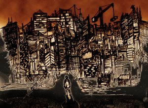
Posted: February 5, 2014 Filed under: Contextualisation, Field | Tags: alone in the city, Art, artist, city, city loneliness, digital art, Drawing, dripping ink, Fine Art, influence, Ink, inspirational art, loneliness, loneliness art, Mixed media, monochrome, overwhelming, painting, sepia tones, visual art Leave a commentThis artists work grabbed me as soon as I saw it. I love the scratchy line work and limited dull colour palette. I am highly influenced by how the use of dark line and monochrome and sepia tones are heightening the loneliness of the single figure in the foreground of the piece. The figure looks overwhelmed by the city and alone, emotions I would like to capture within my work.
The piece below “Alone in the City” is a combination of hands on drawing and digital editing. Unfortunately I am unsure of the name of the talent that produced this piece, but they show their work under the username shoe18.
http://shoe18.deviantart.com/art/Alone-in-the-City-170647391
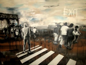
This colour palette and the idea of mixing media’s is something I am keen to start working with. The varied tone within each colour gives the piece a lot of mood and draws me to think about the use of black and brown drawing inks to capture similar effects. Maybe I could use the ink as a ground and then paint and draw into it. This style really jumps out at me and reminds me of a piece I saw in Berlin in the Urban Spree Gallery shown below.
Again in this piece, even though there is a hint of blue coming through, the colour palette is based around blacks browns and white. I am definitely going to be heavily inspired by the works of both these artists and experiment with showing how you can be lonely even when you are around many people whilst employing inspirations from their style and limited colours. Unfortunately, again I’m not sure of the name of this artist’s work, it was tucked away on the floor in the gallery in Berlin but instantly grabbed me as a useful influence to my art work. The uncontrolled drips within this work are something that I would like to experiment with too. Already cannot wait to get stuck in.










Recent Comments