PAINTING: Working with Monochrome and Being More Gestural
Posted: March 15, 2014 Filed under: Documentation, Field | Tags: Art, Art Student, artist, Black and White, Brush, city loneliness, colour, experiments, Fine Art, gestural, lonely, monochrome, monochrome paintings, painting, Paintings, palette knife, singled out, surrounded by others but alone, tones of grey, white silhouettes 6 CommentsAfter attending a tutorial on Monday, I was glad that the tutor gave me some direction and new ideas and techniques to work with. After looking at my work, she suggested that I work with Monochrome and use the tones of grey to enhance the feeling of loneliness and make the individual coloured figure appear even more singled out and alone.
She also felt that my work was not really gelling as a whole and that I was working with three different realities and had to express the relationship between the figures, the single figure and the architecture. She said she thought the detailed buildings that were included in my work detracted from the figures and from the message within the pieces. She suggested that I experiment with contrasting colours, monochrome and full colour as well as contrasting languages, the gestural and the more realistic. I was encouraged to make marks and shapes that represent the buildings and to make them more gestural rather than focusing on every detail, window or door etc. I have experimented with making less detailed marks to create the city landscape with both brush and palette knife.

I feel that working with a palette knife definitely helped me be less controlled and more gestural but doesn’t really gel with the figures painted with a brush and therefore is unsuccessful so I have experimented with more gestural brush work.

I think this is far more successful and the monochrome definitely heightens the feeling of loneliness and the colours of the lone figure. After producing this piece, I decided to experiment with how much of the surrounding is seen within the painting, because even though the technique is successful, I feel that the buildings still are overwhelming the figures here.

This definitely puts emphasis on the lone figure and draws the viewer to wonder why they are the only one not painted as a white silhouette and consider their loneliness rather than being distracted by the buildings in the piece. These are highly valid experiments and have inspired me to create a final piece working with monochrome rather than the sepia alternative I have worked with previously. I feel this colour palette and deeper contrast portrays a more negative vibe and adds to the feeling of loneliness within the work.
Mould Paintings: Mixed Media
Posted: October 27, 2013 Filed under: Documentation, Subject | Tags: Acrylic Paint, Art, canvas, cotton wool, Decay, experiments, Fine Art, Mixed media, Mould, paint, painting, Sugar, Time Leave a comment

 =
=


Above are images of some mixed media pieces on canvas that I have produced, in the aim of replicating mould and decay. I experimented with a vast variety of materials to see what gave me the best effect. These pieces are highly mixed media and are made out of: Acrylic Paint, Sugar, Salt, Modelling paste, Cotton wool, sponge, thread and Water. The paint has been applied in a variety of different ways and I found that mixing paint with sugar and thickening it with modelling paste gave me an amazing granular effect which lent itself very well to working on top of in layers to create a mouldy feel. I also surveyed a variety of people to ask them what they thought they were looking at and they all said mould, some of them even said bread mould which was more specific. I really enjoyed making these pieces and playing around with unusual materials, I feel these pieces are incredibly successful and that I have captured decay in its roarest form. I had to document decay for quite a while before I felt able to replecate the mould that was growing in paint. I definitely want to experiment more with mixed media and maybe create mould pieces like this on a much larger scale.
SCREEN PRINTING WORKSHOP: Decaying Strawberry
Posted: October 20, 2013 Filed under: Documentation, Subject | Tags: Color Blend, documentation, experiments, Fine Art, practice, Print, Process, Screen printing, Stencil, Workshop Leave a commentIn this print workshop, I learnt about screen printing and colour blending. I found it very interesting that the more pulls you make on the screen the more blended the colours were. I experimented with stencils and pulling over the top of them with new colours to leave the old ones exposed underneath the stencil. I wanted to relate this workshop to my investigation into decay so I cut out a stencil from newsprint of a moulding strawberry. I was incredibly happy with the amount of detail I was able to pick up on the print through this method. Below is my Final Print. Having the colours coming through underneath is highly effective.

Below are some practice prints I made by pulling coloured ink onto plain white paper. I managed to achieve quite a detailed result.


I enjoyed learning about printing on top of prints and new techniques within screen printing. I think Print is something I would like to experiment with more in the future. It is great that all these facilities and areas of fine art are available to me. It encourages me to think about making work that usually I probably wouldn’t have experimented with.
PAINTING AND DRAWING EXPERIMENTS
Posted: October 15, 2013 Filed under: Documentation, Subject | Tags: Art, Color, Cross Hatching, Decay, Drawing, experiments, Fine Art, Fine Liner, fruit, paint, Pen, practice, visual art Leave a commentHere are some images of a few painting and drawing experiments I have produced relating to moulding fruit and vegetables. I have experimented here with backgrounds, I painted a simple acrylic wash in the colours of moulds and drawn and painted on top of them with different sized pens to explore a variety of different effects. Personally I quite like the solid painting with a dabbing technique over the top of a more transparent wash, it adds importance and solidity to the item of food I am trying to portray. I like the idea of starting with a simple background and working on top of it and it is definitely something I think I could work with on bigger pieces further down the line in my project.

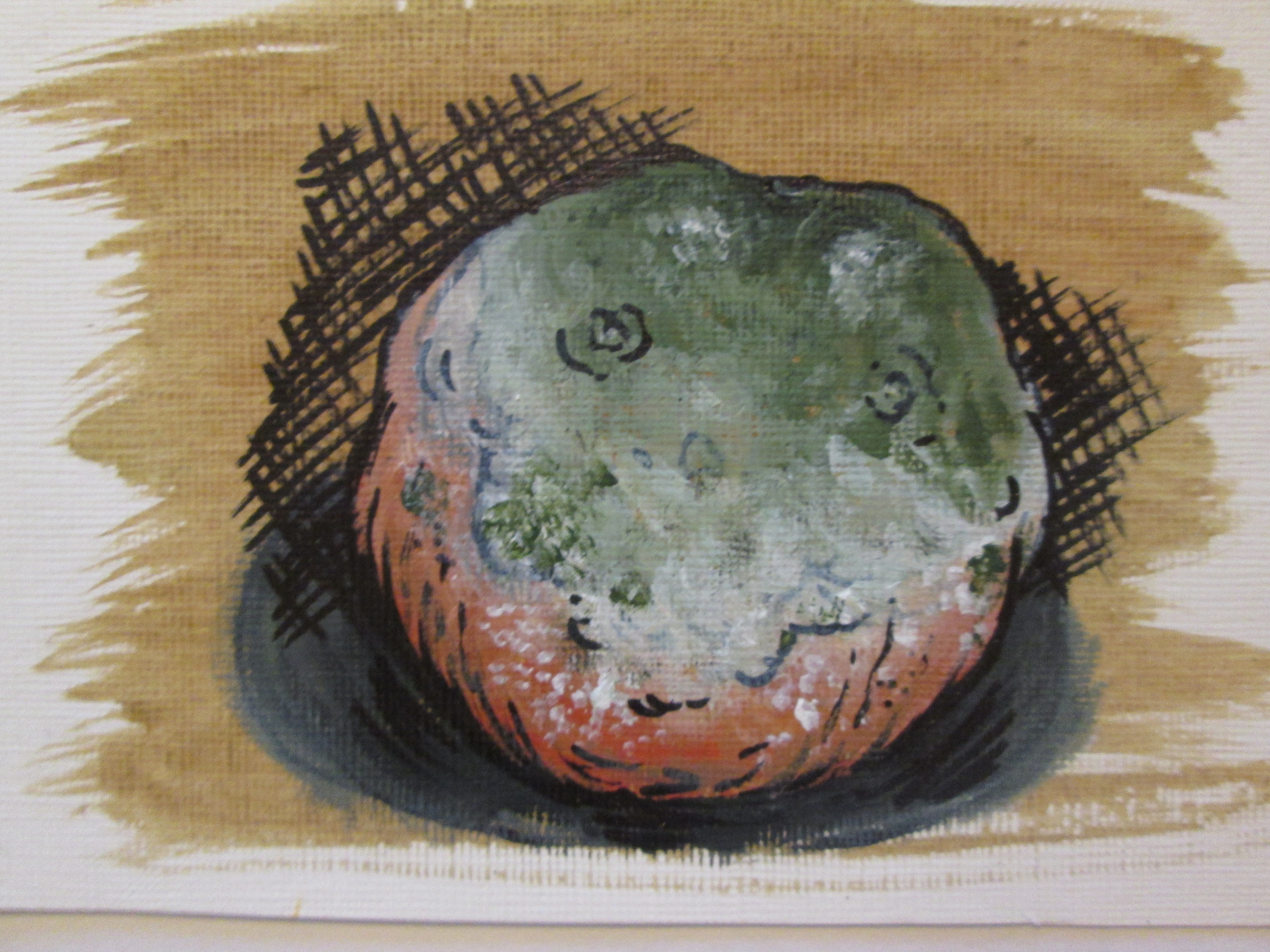
The thicker pen lines make the drawings look too cartoony and not as professional in my opinion. The thinner pen line looks much more presentable and fitting for capturing the essence of decaying food items.
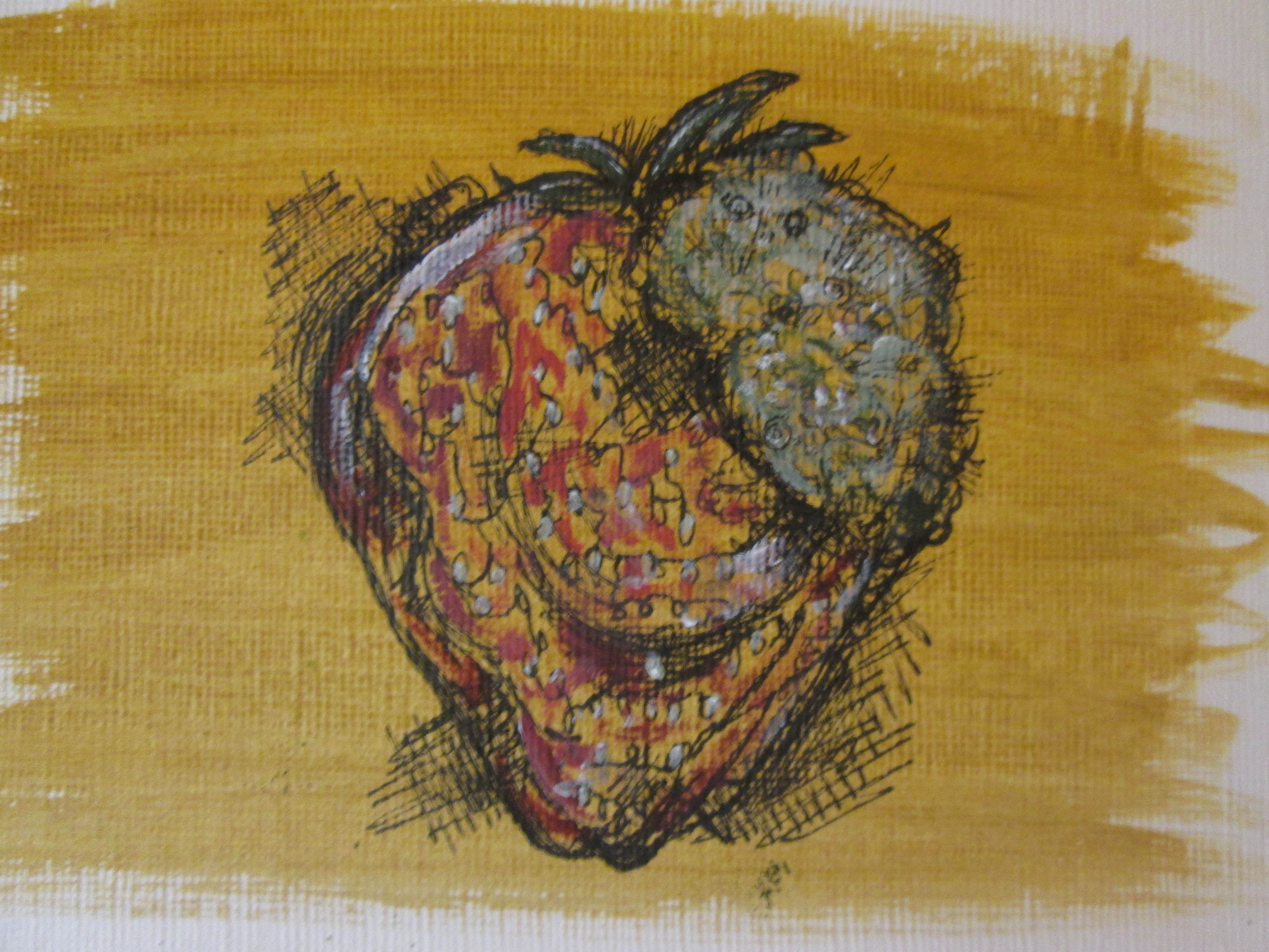
I like the thin pen lines in this piece and the way that you can see the background through the strawberry, this is also a nice effect to have within a drawing and the slight highlights make it look more three-dimensional. Cross hatching on top of colour looks far more appealing.

I think adding a background to the work also changes the colour of the piece as a whole, so the darker backgrounds tend to dull the colours you apply on top a little bit which is a highly desirable effect to suit the credentials of my project. I may experiment with more drawing on top of grounds and incorporate other medias like charcoal or pastels.


Recent Comments