PAINTING: Working with Monochrome and Being More Gestural
Posted: March 15, 2014 Filed under: Documentation, Field | Tags: Art, Art Student, artist, Black and White, Brush, city loneliness, colour, experiments, Fine Art, gestural, lonely, monochrome, monochrome paintings, painting, Paintings, palette knife, singled out, surrounded by others but alone, tones of grey, white silhouettes 6 CommentsAfter attending a tutorial on Monday, I was glad that the tutor gave me some direction and new ideas and techniques to work with. After looking at my work, she suggested that I work with Monochrome and use the tones of grey to enhance the feeling of loneliness and make the individual coloured figure appear even more singled out and alone.
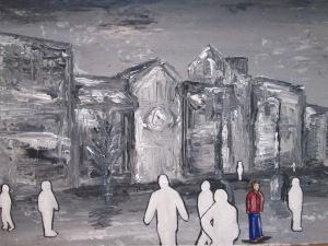
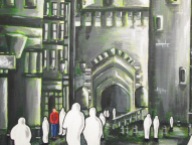
She also felt that my work was not really gelling as a whole and that I was working with three different realities and had to express the relationship between the figures, the single figure and the architecture. She said she thought the detailed buildings that were included in my work detracted from the figures and from the message within the pieces. She suggested that I experiment with contrasting colours, monochrome and full colour as well as contrasting languages, the gestural and the more realistic. I was encouraged to make marks and shapes that represent the buildings and to make them more gestural rather than focusing on every detail, window or door etc. I have experimented with making less detailed marks to create the city landscape with both brush and palette knife.
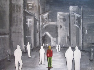
I feel that working with a palette knife definitely helped me be less controlled and more gestural but doesn’t really gel with the figures painted with a brush and therefore is unsuccessful so I have experimented with more gestural brush work.
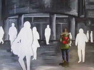
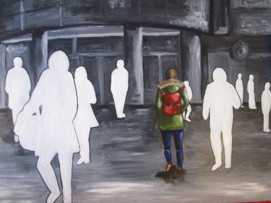
I think this is far more successful and the monochrome definitely heightens the feeling of loneliness and the colours of the lone figure. After producing this piece, I decided to experiment with how much of the surrounding is seen within the painting, because even though the technique is successful, I feel that the buildings still are overwhelming the figures here.
This definitely puts emphasis on the lone figure and draws the viewer to wonder why they are the only one not painted as a white silhouette and consider their loneliness rather than being distracted by the buildings in the piece. These are highly valid experiments and have inspired me to create a final piece working with monochrome rather than the sepia alternative I have worked with previously. I feel this colour palette and deeper contrast portrays a more negative vibe and adds to the feeling of loneliness within the work.








Recent Comments