SHAPED PAINTING: Working on Green Under-Painting
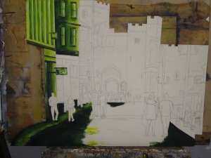
Posted: March 4, 2014 Filed under: Documentation, Field | Tags: Acrylic Paint, Art, Art Student, artist, city loneliness, city scape, experimentation, Fine Art, green, green ground, green underpainting, highlights, loneliness, paint, painting, shadows, tonal variation, tone, tones of green, underpainting, workshop work Leave a commentI have started working on the green under-painting of my shaped piece that I started in Mondays paint workshop. When I previously produced a green under-painting of a still life, I found that the tones I had worked with in the green underlay really informed the shadows and highlights that I painted when rendering the top coat. I found that I produced a far more three-dimensional and tonal outcome and that it was easier and quicker to do as I had already thought about tonal variation in the under-painting.
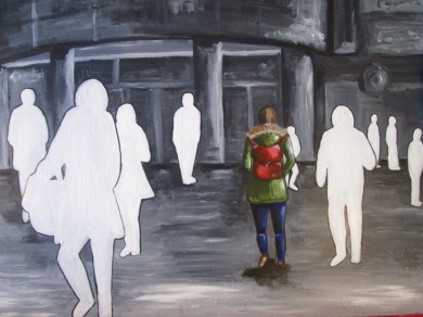
In this shaped piece, I am taking more time on the under-painting and focusing on achieving dimension and tone within it. Also, I was really surprised by how well the green showed through my work when applying the top layer with a method of dry brushing and so this is something I will be working with again. I will document the progress of this painting and work hard to create a highly successful outcome portraying the hidden loneliness of the city. I will incorporate the white silhouette imagery I have been working with into this piece and work at creating a visually successful piece. I have never made a shaped painting, but I can see how it is going to make for an interesting outcome already. I am really enjoying the paint sessions and have already learnt many valuable skills that I have already started applying in my project work.
More Photo Manipulation Experiments: Loneliness in the City
Posted: February 26, 2014 Filed under: Documentation, Field | Tags: alone, Art, Art Student, black and white photography, city, City Art, city photography, cut out, existential loneliness, experimentation, figures, Fine Art, hidden loneliness, loneliness in the city, photo editing by hand, photo manipulation, Photograph, Photography, urban loneliness Leave a commentAs my tutor suggested, I have been conducting further experimentation into portraying the hidden loneliness of the city through photo manipulation. He suggested I considered the fact that I didn’t have to cut out the whole of the figures from my photos and that I could make statements by just cutting out certain parts. Below, I have experimented with cutting or blocking out the face of all the bodies bar one to portray the fact that in the city, all the people around you may as well just be bodies with no identity just moving around you. As you do not interact with them, they may as well have blank faces. I think this definitely shows one person to be singled out and portrays the feeling of being alone, but I do not think this manipulation is as successful as cutting out the whole figure and for me does not make as bigger impact. The white cut out faces are clear, but I feel the image below where I have blacked out the faces is highly unsuccessful and the act of manipulation is unclear.
Throughout my exploration of photo manipulation, I have focused on the fact that all the people around you in the city may as well not exist, but until now I haven’t portrayed the fact that you may as well not exist to them either. Below are some images I have worked with in portraying this idea. Feeling unnoticed and unappreciated by others is a massive contributor to feeling isolated or alone.
Here, I have scribbled out one figure. I think this is successful in making a subtle statement about people feeling lonely and going unnoticed in the city, It is not immediately obvious until you really look at the picture and draws you in to think about the reason behind blacking out a person. Below, I picked someone who goes unnoticed and is ignored by many on a daily basis, a big issue salesman and scribbled out their face to heighten the fact that their identity is unappreciated.
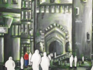
In my opinion, these below are my two most successful manipulations in showing the fact that you may as well not exist to others in the city, and how lonely it can feel being unnoticed. The figure is obviously singled out and prominently taken out of the picture portraying the fact that they may as well not be in it in the first place. Being different can evoke feelings of loneliness and here a white silhouette differentiates the figure from the others.
Experimenting further with photo manipulation has definitely given me new angles to explore feelings of loneliness in the city and I have explored different ways of portraying these angles. As my tutor suggested, I am now going to do some more experimentation with tracing paper and combining it with my photographs.








Recent Comments